Small web-based tools and visualizations, each built around a question or problem worth solving.
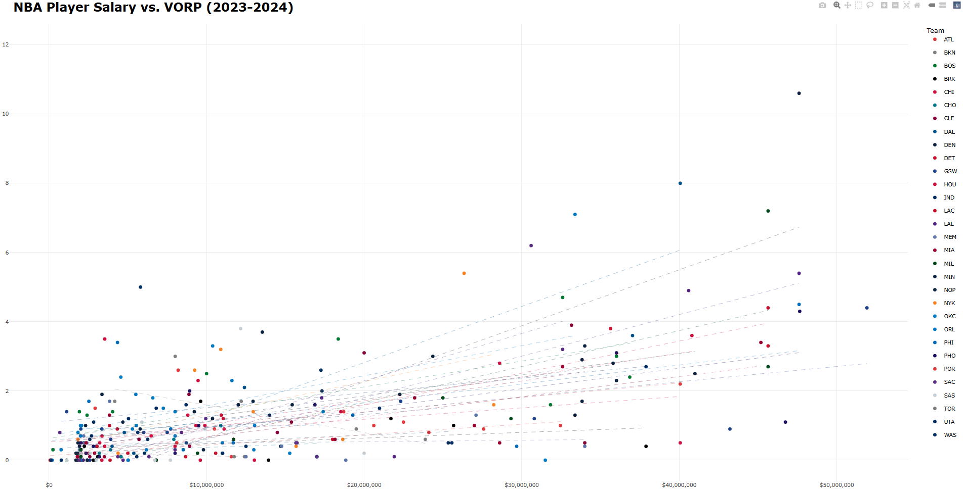
Interactive NBA Salary vs VORP Plot
Background
NBA salaries are very enormous, very public, and very often controversial. Every offseason, teams hand out massive contracts for tens of millions (sometimes hundreds of millions). Every season, some of those contracts look very smart, and others look very bad. For an interactive visualization class project, I wanted to actually look at this — which players are earning their contracts, which are underperforming them, and which teams are quietly getting great value.
The metric I used to measure player performance is VORP — Value Over Replacement Player. It’s a catch-all basketball stat that estimates how much a player contributes relative to a league-average replacement. It’s not perfect, but it does a reasonable job of collapsing a player’s full contribution into a single number, which makes it useful for a basic one-visualization comparison against salary.
Build
This was built in R using ggplot2 and plotly. Each player is plotted as a point — salary on the x-axis, VORP on the y-axis — color-coded by team, with a per-team best-fit line. Players above the trend line are outperforming their pay; players below it aren’t.
The most interesting part to build was the hover interaction, which highlights a hovered team’s players while fading out everyone else. plotly doesn’t support this out of the box, so it required injecting a small JavaScript callback directly into the widget:
myPlot.on('plotly_hover', function(data){
  var hoveredTeam = data.points[0].fullData.name;
  var update = {
    'marker.opacity': Array(x.data.length).fill(0.1)
  };
  for (var i = 0; i < x.data.length; i++) {
    if (x.data[i].name === hoveredTeam) {
      update['marker.opacity'][i] = 1;
    }
  }
  Plotly.restyle(myPlot, update);
})
There could be plenty of analysis done on salaries in professional sports leagues - which players are doing the worst/best, which teams are getting the most value out of their players, etc., but I was taking 18 credits and working 30 hours a week.
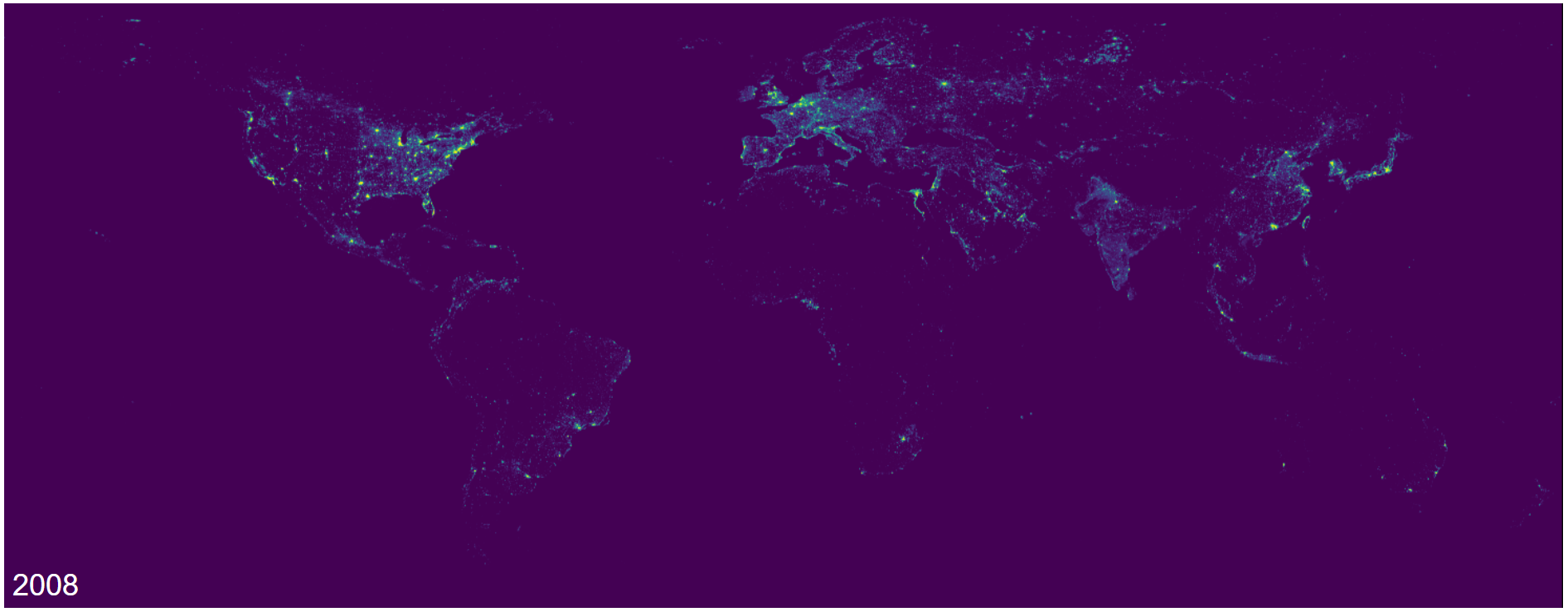
Animated Light Pollution Map
Background
Light pollution is one of those problems that’s easy to ignore because you can’t see what you’re missing. Most people living in cities have never seen the Milky Way with the naked eye — not because it’s gone, obviously, but because it’s been drowned out by artificial light. What makes it even worse is that most people don’t know what they’re missing. The night sky that humans have looked up at for all of history is disappearing, and it’s happening quietly enough that most people haven’t noticed.
For a class project where we got to pick our own dynamic web visualization, I wanted to show exactly how that’s changed over time. A research team ((Li et al., 2020)) published a harmonized global nighttime light dataset that standardizes satellite readings across different sensors — 27 years of data, 1992 to 2018, all in a consistent format.
Build
The data comes as GeoTIFF files, a raster image format used in geographic information systems that I had never seen in my life prior to working on this. Each file represents one year of averaged nighttime light intensity across the entire Earth. I converted each TIFF to a PNG using Python, then wrote a simple webpage to animate them in sequence with a speed slider.
The JavaScript for the actual animation is about as minimal as it gets — a loop that swaps the image source every N milliseconds, where N is controlled by the slider:
function animateMap() {
    updateMap();
    currentYearIndex = (currentYearIndex + 1) % years.length;
    setTimeout(animateMap, animationSpeed);
}
All updateMap() does is pull the map for the currentYearIndex and change the source of the map object. Very simple, but the visualization shows what is a massive change in our night sky over just the past few decades. Yes, this could’ve just been done by turning the sequenced .png files into a .gif, but I wasn’t allowed to do that for the project.
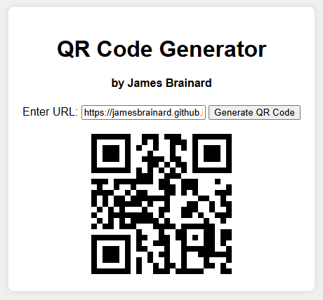
QR Code Generator
Background
QR (Quick Response) codes are not necessarily “generated” as much as they are “translated.” A QR code is the exact same, no matter who or what does the translation. This is because QR codes follow an open international standard (ISO/IEC 18004), which means that the same input will always translate to the same output. There’s no secrets, and notably, no reason for a middleman.
Which, in my opinion, makes what QR code websites do strange, misleading, and a little scammy.
Rather than translating a given URL into the pattern associated with it, many of them intercept it, routing the code through their own servers so that they can track scans, show ads, or put the whole thing behind a paywall. The QR codes that these websites generate don’t point towatrds your link, they point towards their redirect, which points to your link. It allows them to self-insert into a process that just doesn’t need them.
In the spring of 2024, some friends needed to generate dozens of QR codes for Creighton’s fall/spring break Service & Justice Trips, and they fell into this trap. Websites would lock a certain number of QR codes behind a paywall, force scanners through advertiser links, put time limits on codes, or some combination of the three. It’s predatory, especially because most people aren’t aware of how QR codes actually work.
Build
The Javascript code for this project is actually pretty simple - only about 30 lines of code, which tells you something about how overcomplicated the alternatives are. The heavy lifting is done by QRious, an open-source library built specifically for this:
function generateQRCode() {
    const urlInput = document.getElementById("urlInput");
    const inputValue = urlInput.value;

    if (inputValue.trim() !== "") {
        const qrcodeContainer = document.getElementById("qrcode");
        qrcodeContainer.innerHTML = "";

        try {
            const qr = new QRious({
                value: inputValue,
                size: 200,
            });

            const qrCodeImg = document.createElement("img");

            qrCodeImg.src = qr.toDataURL();

            qrcodeContainer.appendChild(qrCodeImg);
        } catch (error) {
            console.error("Error generating QR code:", error);
            alert("Error generating QR code. Please check the console for details.");
        }
    } else {
        alert("Please enter a valid URL");
    }
}

document.getElementById("urlInput").addEventListener("keydown", function (event) {
    if (event.key === "Enter") {
        generateQRCode();
    }
});
This code makes use of QRious, a Javascript-based library literally made for generating QR codes. The web page is as minimal as possible, because users just want to generate a QR code, not look at flashy colors (or worse, ads).
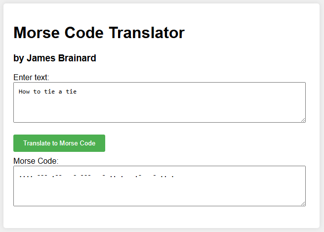
Morse Code Translator
Background
Morse code isn’t necessarily a language - rather, it’s an encoding scheme, a way of representing the entire alphabet using what could be described as a version of binary. Simplifying language down to the presence or absence of a single tone over time is what’s made Morse code so valuable.
Build
Pretty straightforward - type text in one box, get Morse code in the other. This was a very early exercise for me in my learning journey.
function translateToMorse() {
    const text = document.getElementById('inputText').value.toUpperCase();
    const morseCode = text.split('').map(charToMorse).join(' ');
    document.getElementById('outputMorse').value = morseCode;
}

function charToMorse(char) {
    switch (char) {
        case 'A': return '.-';
        case 'B': return '-...';
        case 'C': return '-.-.';
        case 'D': return '-..';
        case 'E': return '.';
        case 'F': return '..-.';
        case 'G': return '--.';
        case 'H': return '....';
        case 'I': return '..';
        case 'J': return '.---';
        case 'K': return '-.-';
        case 'L': return '.-..';
        case 'M': return '--';
        case 'N': return '-.';
        case 'O': return '---';
        case 'P': return '.--.';
        case 'Q': return '--.-';
        case 'R': return '.-.';
        case 'S': return '...';
        case 'T': return '-';
        case 'U': return '..-';
        case 'V': return '...-';
        case 'W': return '.--';
        case 'X': return '-..-';
        case 'Y': return '-.--';
        case 'Z': return '--..';
        case '0': return '-----';
        case '1': return '.----';
        case '2': return '..---';
        case '3': return '...--';
        case '4': return '....-';
        case '5': return '.....';
        case '6': return '-....';
        case '7': return '--...';
        case '8': return '---..';
        case '9': return '----.';
        case ' ': return ' '; // space
        default: return ''; // ignore unknown characters
    }
}
If I were to build this again, I’d replace this big ugly switch statement with a plain JavaScript object (const morseMap = { 'A': '.-', ... })